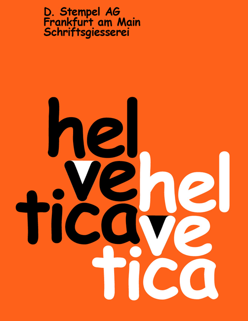
Comic Sans
So in grad school, my whole thing was “anti.” Who am I kidding, I’m still like that personally, but I’m less interested in constructing my design identity around it. Anyways, one thing that always drove me nuts was when designers rag on regular people using Comic Sans — it’s like, ok, it’s not a great typeface, but clearly it’s expressing something that people are responding to. So maybe the more interesting thing is thinking about that, rather than taking cheap dunks on non-designers just trying to put up a office note.
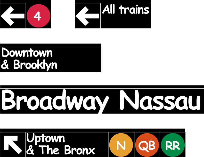
Anyways I did a project where I redid classics of the design canon in Comic Sans for fun and I still love it. The funny thing to me is that I am defending a low-brow move by inserting into some esoteric references! I think the framework I did it in was as a teaching project: teach the design canon to students and have them redo the classics, changing just one thing, which I still think is a pretty great idea. May all then google hits for comic sans keep coming!